
About
FLX is Kohls’ new sustainably sourced, size inclusive athleisure brand released in Spring 2021.
My Role
As a Kohl’s Product Design summer intern, I spent 8.5 weeks on a solo project to redesign the FLX website. I conducted user and market research, designed a prototype, and ran usability studies with target users to gain valuable feedback. At the end of the internship, I presented my work to the Kohl’s Product Design Leadership team.
Skills/Tools
Lean UX, Competitor Analysis, Journey Mapping, Empathy Mapping, User Interviews, Figma Wireframes, Prototyping, Assumption Tracking, Usability Testing, Data Synthesis

Problem
How might we redesign the FLX Omni-channel experience (product page, in-store experience, etc...) to increase pageviews and/or conversion?

Discovery
Competitor Analysis
Conducted a competitor analysis of activewear websites, focusing on browsing features and product pages
Aerie, which is very popular for a younger demographic, uses full screen images of people outside to make the clothes more relatable and energetic
Websites with a stronger sustainability message were very transparent about the sourcing of their material and exactly how they impacted the environment.
Empathy Map
Created an empathy map to understand target FLX customer
Users are people in their twenties with an active lifestyle
Users are seeking high quality activewear at a cheaper price, and they want to feel comfortable, stylish, and confident
Kohl’s Store Visit
I wonder how different mannequin outfit choices might bring in different customers. FLX also offers a selection of plus size activewear. I wonder if using plus size mannequins could attract new customers?
Pictures on the FLX signs have white backgrounds. I wonder what it would look like if there were photos of people outside, smiling, and enjoying the product?
I noticed that most FLX clothes had stickers on them. When I tried on a pair of leggings, the sticker fell off and stuck to the floor. Adding stickers to clothes goes against the message of sustainability, and they could be a pain for store associates. I wonder if we need the stickers?
Journey Map
I created two journey maps: the current user experience searching for Kohl’s FLX leggings and generally browsing for Kohl’s activewear.

Initial Design Ideas

Sustainability Signage
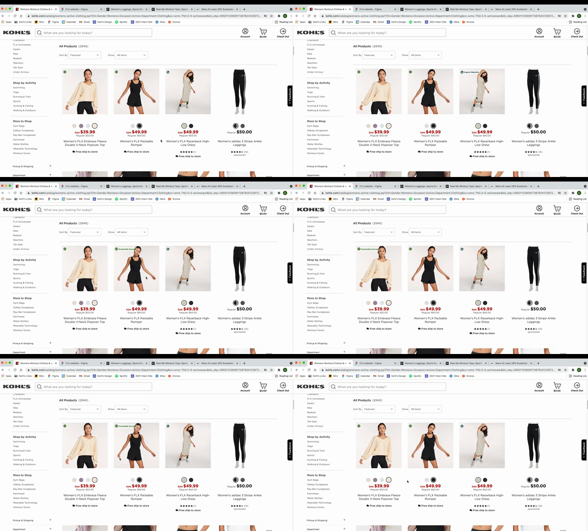
During my competitor analysis, I noticed that multiple companies, including Nike and Urban Outfitters, use graphics/text to highlight sustainable items while browsing.
I placed existing Kohl’s sustainability icons on product pages to point customers towards FLX.
Women’s Dropdown
During my user interviews, I noticed that both users went straight to the women’s dropdown when searching for FLX.
I created “Featured Brand” and “Sustainable Materials” sections in the dropdown to highlight FLX and make it easier to find.

Women’s Workout Tops Page
I noticed many Adidas ads throughout the website
I designed an FLX ad that could be incorporated into the products section

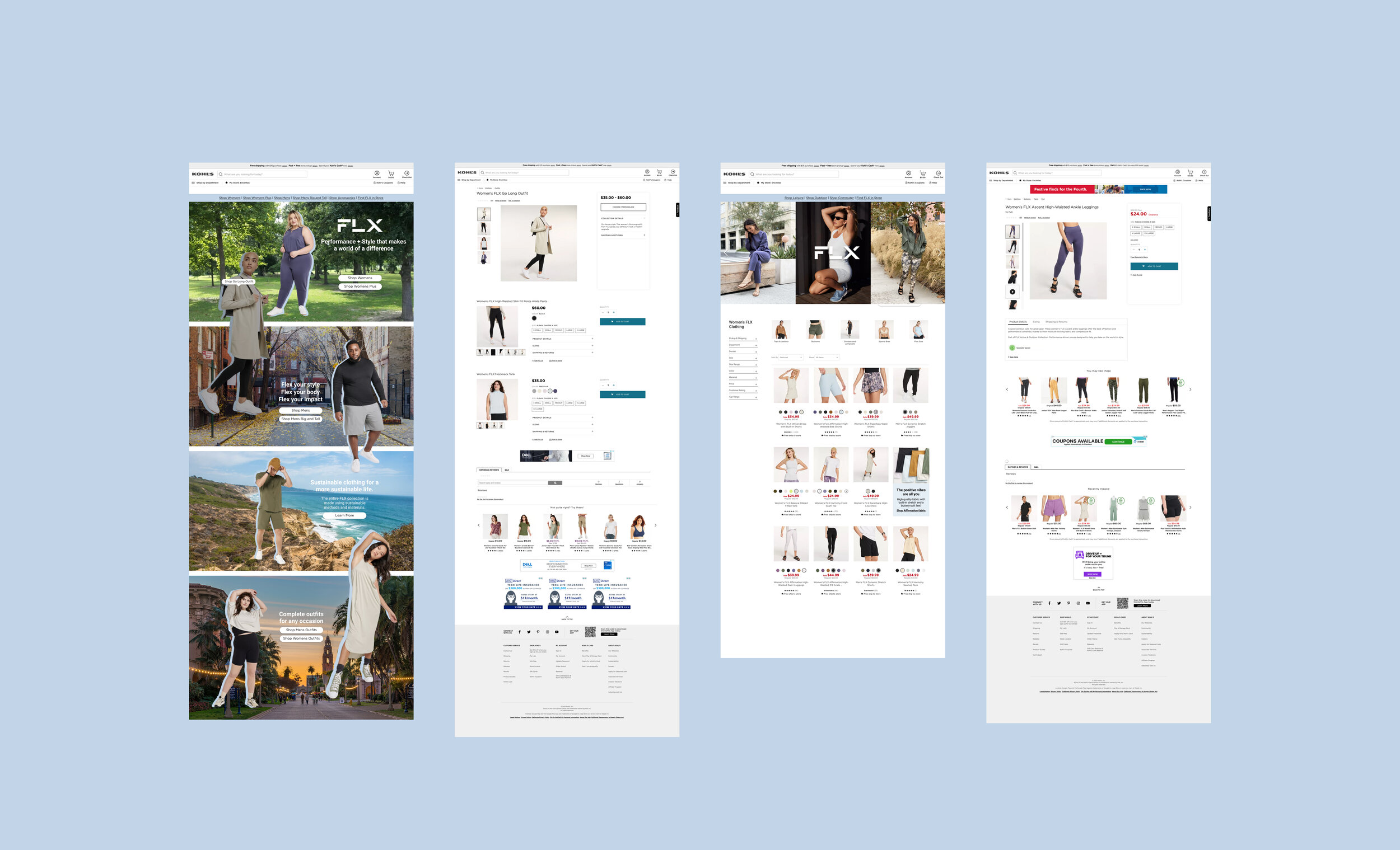
FLX Home Page
I made multiple iterations of the FLX home page. My goals:
Make the page easier to navigate
Highlight FLX’s sustainability values
Make the page relatable to a younger demographic

FLX Women’s Page
I made multiple iterations of the women’s page
Focused on simplicity and bringing products to the top of the page
Inspired by Lululemon’s layout

Usability Study
Objective
The objective of this test is to learn if the redesigned site is easier to navigate. I also wanted to learn about how Gen Z/Millenial women perceive FLX after viewing and interacting with the redesigned website.
Test Parameters
Five fifteen minute Usability Studies on Zoom/Google meet from July 19 - 22
Participants were women age 20 - 35
Summary
Overall, the tests went smoothly and ⅘ users completed the task by navigating the website using the expected route. Multiple users pointed out that they liked the pictures of people outdoors and could imagine themselves wearing FLX like the people in the photos.
Next Steps
Redesign the “Shop Affirmation Fabric” card so that users can understand what it means from a glance
Add in a feature to click on outfits on the home page and shop from them
Remove the option to shop from the home page

Final Design

Design Changes
If you hover on the outfits on the home page, you have the option to shop for that particular outfit.
I removed the ability to shop from the home page, and instead added in a new “outfits” panel to highlight shopping for full outfits
I changed the wording on the “Shop Affirmation Fabric” card to make it easier to understand.
Next Steps…
Which outfits would be best to highlight on the home page?
A/B test with redesigned site versus the current site


